If you run a roll-up in home services — HVAC, plumbing, roofing, pest control, landscaping — or in any local consumer category, you know the frustrating asymmetry of early-stage diligence. The single most important operational fact about a target is where its customers live: that geography determines route density, dispatch economics, and brand reach.
And for a platform buyer the question is really comparative — lay a target’s customer map over your own, and you learn whether you’re buying density inside routes you already run, jobs that fold into existing truck-days, or paying for a bridge into neighborhoods you’ve never served. Tuck-in or territory entry, the answer is on that map. Yet it’s exactly the fact you can’t get until a seller decides to open the CRM, weeks or months into a process.
In fact, an accurate estimate of that customer map can be constructed from publicly available information.
The Idea: Reviewers Reveal Where They Live
Every consumer-facing business of any size has a Google Business Profile with reviews. Most reviewers of a local business are real customers — Google doesn’t verify purchases, but few people write a review of an HVAC company they never hired — and in home services specifically, the reviewer’s own home was usually the service address. Each reviewer also has a public profile listing their other reviews — restaurants, dry cleaners, veterinarians, gyms.
Those other reviews have locations, and people overwhelmingly review places near where they live. Turning that raw signal into a home estimate is the hard part — a single review history mixes home life with commutes, road trips, vacations, old cities the reviewer moved away from, and outright noise. Our model runs each history through a multi-stage inference pipeline — category and travel screening, distance filtering, density clustering with fallback strategies for sparse and ambiguous histories, and pattern checks that catch incoherent or manufactured profiles — before it will commit to an answer. The output is deliberately not an address: it’s a neighborhood-scale home area, which is all a diligence question needs. (Solicited and fake reviewers exist in every consumer vertical; their histories tend to fail the coherence checks, and at thousands of reviewers the residue dilutes rather than distorts.) Do this for every reviewer of a business and you have a customer-density estimate built entirely from publicly available data.
Two properties make this unusually well-suited to diligence work:
- It’s outside-in. No data room, no seller cooperation, no NDA. You can run it on any target on a screening list — or on every competitor in a market.
- It has a time axis. Each reviewer is stamped by the year they reviewed the business, so you can watch the customer footprint evolve across a decade. That turns a static map into a story: is the territory expanding, holding, or quietly contracting?
And none of it is specific to home services. The same pipeline maps a car wash, a med spa, a dental group, a gym — any business whose reviewers are its customers. We use an HVAC operator as the example below because home services is where roll-up activity is densest, but the method reads customer geography for essentially any consumer business with a review footprint.
The underlying review data is acquired at modest cost — the data was never the hard part. The value is in the inference: what to filter, how to cluster, when a history is trustworthy, and recognizing the cases where the output shouldn’t be relied on.
Worked Example: a 13,000-Review HVAC Operator in Dallas–Fort Worth
To show what the method produces at full scale, we ran it on A#1 Air, a large HVAC/plumbing/electrical operator based in Lewisville, TX, with one of the biggest review footprints in the Dallas–Fort Worth metroplex. (A#1 Air is used here simply as an example, built entirely from publicly available data — not because it is in any process we’re aware of. We have no relationship with the company, and nothing in this post is a comment on it as an investment. More on limits below.)
The raw material: 13,152 Google reviews — each from a distinct reviewer — and 155,870 reviews from those reviewers’ public histories. From that, the model inferred a home area for 8,091 reviewers (62% of the roster); the rest had too little public history to place.
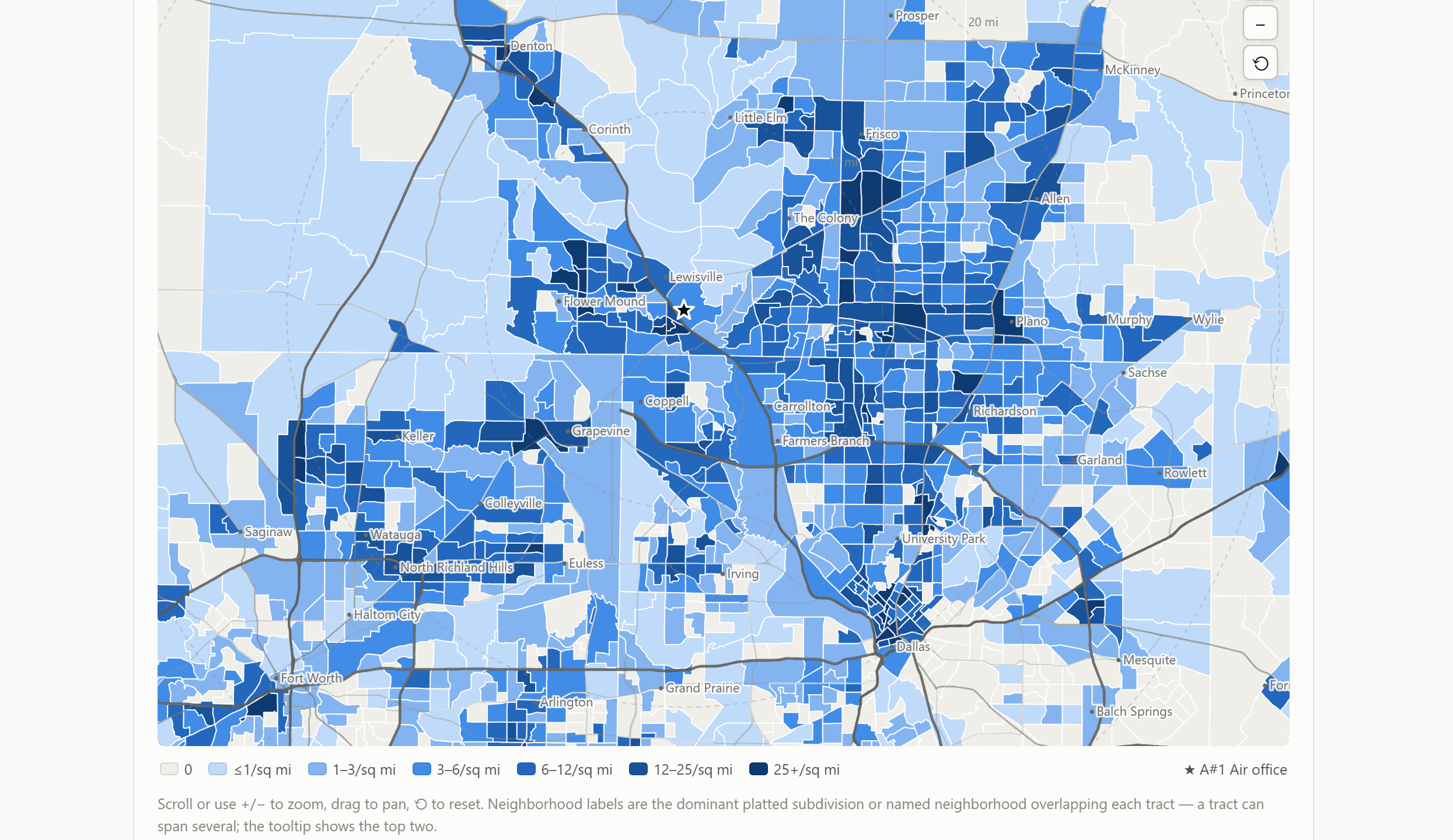
Here’s the customer map — every inferred home from every cohort, 2011 through 2026. Each shaded area is a census-tract-scale neighborhood, labeled with the name residents actually use (pulled from city plat records, county appraisal-district GIS, and other public boundary layers) and colored by customer density, centered on the company’s Lewisville office:
Three findings jump out, and each one is a question you’d normally need a CRM export to answer. (All figures are model estimates from review data.)
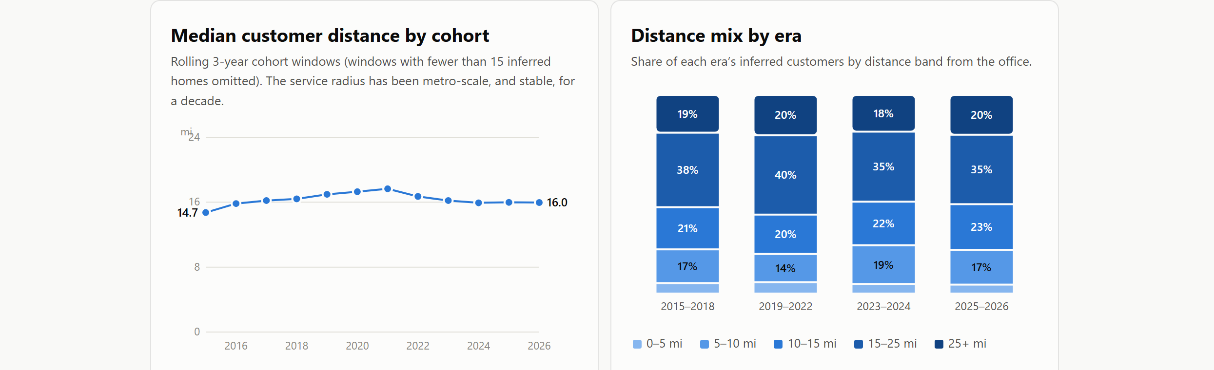
- The service area is the whole metroplex. The inferred median customer home is 16.1 miles from the office. Only 45% sit within 15 miles; 20% are beyond 25 miles, from Denton to Mesquite and McKinney to south Arlington. Distance from the shop barely gates who becomes a customer.
- No anchor neighborhood exists. The single busiest home ZIP holds just 4% of the inferred base. For comparison, when we run the same method on location-driven retail — car washes, for instance — the busiest ZIP typically holds 20%+, with a median around a third of the customer base across the operators we’ve measured. That flat distribution is the signature of a brand-and-dispatch business — demand generated by marketing and reputation, fulfilled by trucks — rather than a location business.
- The footprint has been stable for a decade. Era medians moved 16.3 → 17.0 → 15.8 → 16.0 miles from 2015–18 through 2025–26, even as review volume grew more than tenfold — a few hundred reviews per year through 2021, then 939 (2022), 2,045 (2024), and 4,986 (2025), consistent with the review-request programs that are now standard across home services. Whatever the driver, the geographic reach didn’t move: recent cohorts are an order of magnitude larger within the same territory.
That last chart is the kind of thing worth pausing on in any deal. A seller will often narrate a review-volume curve like this as expansion. The cohort geography lets you test that story: here, growth came from density inside an unchanged footprint, not from new territory. Whether that pattern reads as strength or as a question to probe depends entirely on your thesis — the point is that it’s now a question you can ask with evidence, pre-LOI.
Reading the Map at Neighborhood Level
The neighborhood grain is what makes the map operational — ZIP codes are too coarse for route planning. The 8,091 inferred homes spread across 1,264 neighborhood-scale areas, most carrying the names residents use — Willow Bend and Old Shepard Place in west Plano, Stonebridge Ranch villages in McKinney, Twin Creeks in Allen, Bridlewood in Flower Mound, Castle Hills in Lewisville. No single area holds even 2% of the base, but the concentration is real: 243 areas with 10+ inferred customers hold 59% of the book, led by the US-75/Dallas North Tollway corridor (Plano–Frisco–Allen–McKinney) and the SH-121/Grapevine-Lake arc (Flower Mound–Grapevine–Coppell–Carrollton), with substantial North Dallas and Fort Worth–Arlington clusters behind them.
Screening a Whole Market, Not Just the Deal in Front of You
This is where the technique becomes a sourcing tool rather than a diligence exhibit. The analysis isn’t just preparation for the first meeting — it informs which meetings to pursue in the first place. Want to know which HVAC companies in a metro have customers that line up with your routes? Run it on every HVAC company in the MSA. Every operator with a Google listing gets a customer map — without a process, a banker, or the seller’s participation. The same sweep works in any vertical a roll-up touches: car washes, med spas, veterinary practices, gyms. Overlay each map against your platform’s service footprint and the market sorts itself: the tuck-ins whose customers sit inside your existing routes, the adjacent operators who’d extend you into one new corridor, and the operators whose revenue looks attractive but whose customers sit largely outside your operating footprint.
The same sweep serves opposite strategies — what changes is the sort order. If the goal is a stronger foothold in the territory you already own, you screen for maximum overlap: targets whose density stacks on top of your busiest corridors, where every acquired customer shortens the drive between jobs and the margin gains come from consolidation. If the goal is expansion into new territories, you invert the filter: targets whose customers concentrate precisely where you have no presence, with enough density in their home corridors to support efficient routes from the outset — a beachhead rather than scattered coverage. Either way, the result is an outreach list ranked against your strategy, built well before any target knows it’s being evaluated.
A note on scale: an operator with a few hundred reviews yields a corridor-level map — enough to tell a neighborhood champion from a metro-wide brand and to score route fit; confident neighborhood-by-neighborhood ranking wants a few thousand, like the example here. For screening, corridor-level is exactly what you need.
What Else the Maps Answer
Measure overlap with your platform — quantitatively. Share your customer list with us — handled under NDA — and we deliver the overlap analysis directly: what share of the target’s inferred customers sit in areas you already serve, what share are within three miles of one of your existing customers, and a ranked list of the target’s strongholds where you have no presence today. If you have route data, we go further: what percentage of the target’s customers fall on or near your existing routes, and beyond that, any custom metric your team uses to score fit — the analysis adapts to how you evaluate acquisitions, not the other way around. That’s the tuck-in versus new-territory question — the central question for a roll-up — answered quantitatively, before diligence begins.
Verify seller claims. “We serve the entire metroplex” is checkable. So is “our Frisco expansion is working” — the cohort filter shows when each neighborhood lit up, to roughly the year.
Read route economics from density. Dense clusters mean short hops between jobs; a thin, scattered map means windshield time. Two targets with identical revenue can look completely different on this map, and route density is where service margins are won and lost.
Watch markets over time. Because every observation is time-stamped, the market-wide sweep gains a time axis too: in one study we ran, 19 operators in a single Texas metro, each with its own cohort map, ranked by territory trajectory. That’s moat measurement for a platform, not just target picking.
How We Validate the Inference
We’ve pressure-tested this from three directions. First, stability: before running the full census above, we ran a 600-reviewer pilot sample; it predicted the census within a half-mile on median distance and agreed on every headline pattern — the estimates are stable under sampling. Second, face validity across business types: the same pipeline that shows a flat, metro-wide map for a dispatch business shows tight, top-ZIP-heavy catchments for location-driven retail — the maps look the way the underlying businesses actually work. Third, ground truth: where operators have shared their actual CRM data with us under NDA, the customer geography inferred from reviews has matched it closely — the same corridors, the same concentrations, the same gaps. We treat these maps as screening intelligence, and confirmatory diligence still runs on the CRM; but the method has held up where we’ve been able to test it directly.
Limitations
This is inference from a biased sample, and it should be read that way.
- Reviewers are a proxy, not a census. They skew toward invited, satisfied, digitally-active customers — and a small share may not be customers at all (quote-only contacts, reviews left on the wrong listing), which the aggregate treatment absorbs but doesn’t eliminate. Counts are relative density, not customer totals — the true customer count is a large multiple of the reviewer count.
- A home area is an activity center, accurate to roughly a mile. That’s why we aggregate to neighborhood scale and never to addresses. Fine for route economics; wrong tool for anything finer.
- Old cohorts are read from present-day histories. People move, and Google’s timestamps coarsen with age, so early-year maps are noisier than recent ones.
- Privacy is a design constraint, not an afterthought. Everything is reported only in aggregate. No individual reviewer is identified or shown in any output — the unit of analysis is the neighborhood, never the person.
In short: the public review layer turns customer geography — historically the last thing you learn about a business — into one of the first. It won’t replace confirmatory diligence on a real CRM. But it works at both ends of the deal: sourcing the pipeline — screening a whole market for the targets that fit your strategy, whether that’s densifying the territory you hold or entering the territories you want — and then walking into the first meeting already knowing the shape of the seller’s book. Either way, it moves a data-room question to the top of the funnel.
This kind of work sits alongside the rest of our alternative-data practice for private equity — and if you’re operating a roll-up, the data problems that follow the acquisitions are a discipline of their own; we wrote about those in Data Challenges Unique to PE Roll-Ups.
Methodology note: analysis built from publicly available Google Maps review data acquired as of July 25, 2026; home areas inferred with Sparkle Technologies’ multi-stage clustering model over each reviewer’s public review history; neighborhood boundaries from US Census cartographic files and city/county GIS layers. All figures are statistical estimates and may not reflect A#1 Air’s actual customer base, service area, or operations. A#1 Air was chosen simply as an example; it is referenced for identification purposes only, and Sparkle Technologies has no relationship with the company. This post presents findings, evidence and open questions only — it is not investment advice or a recommendation regarding any company.