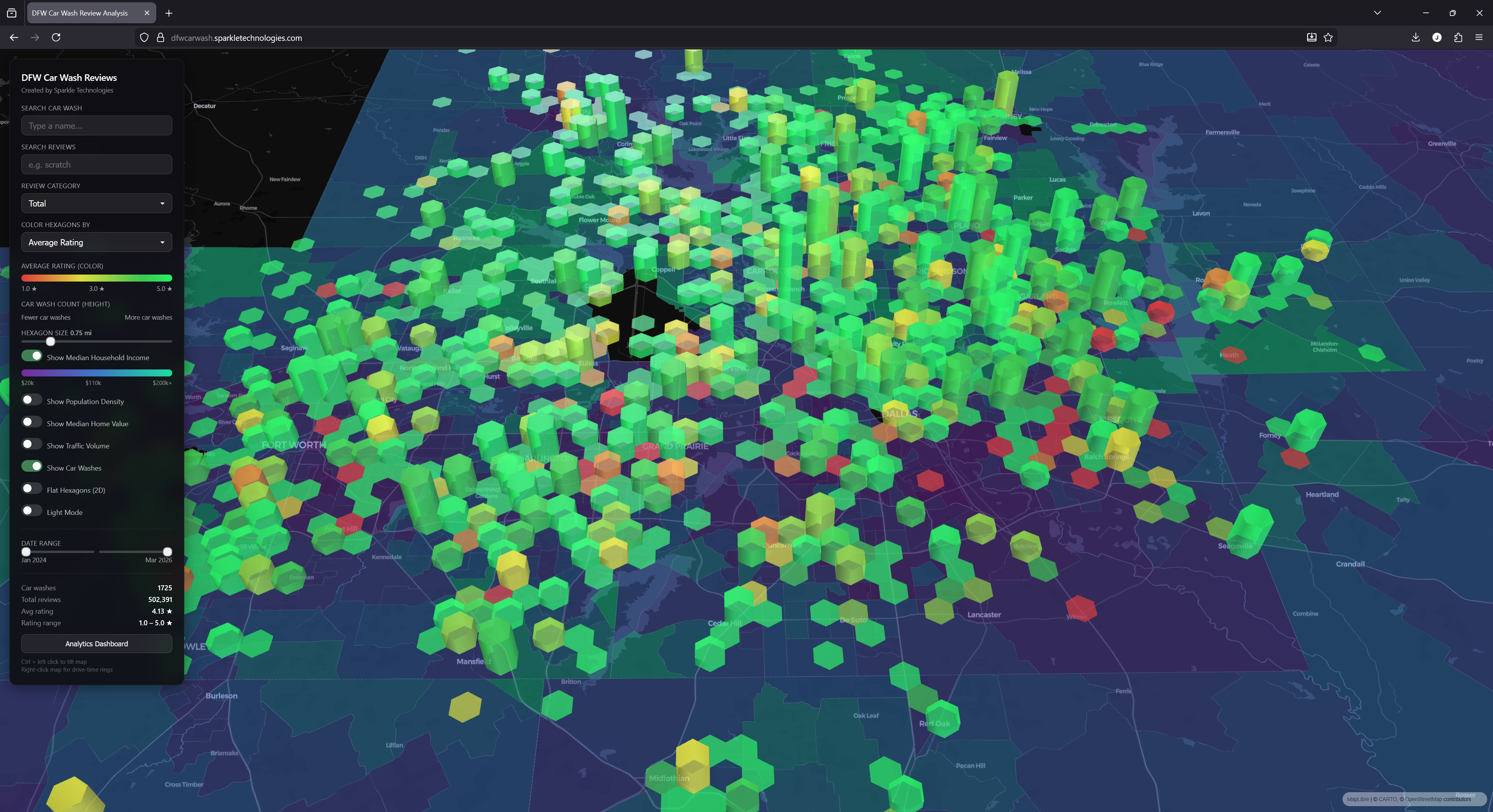
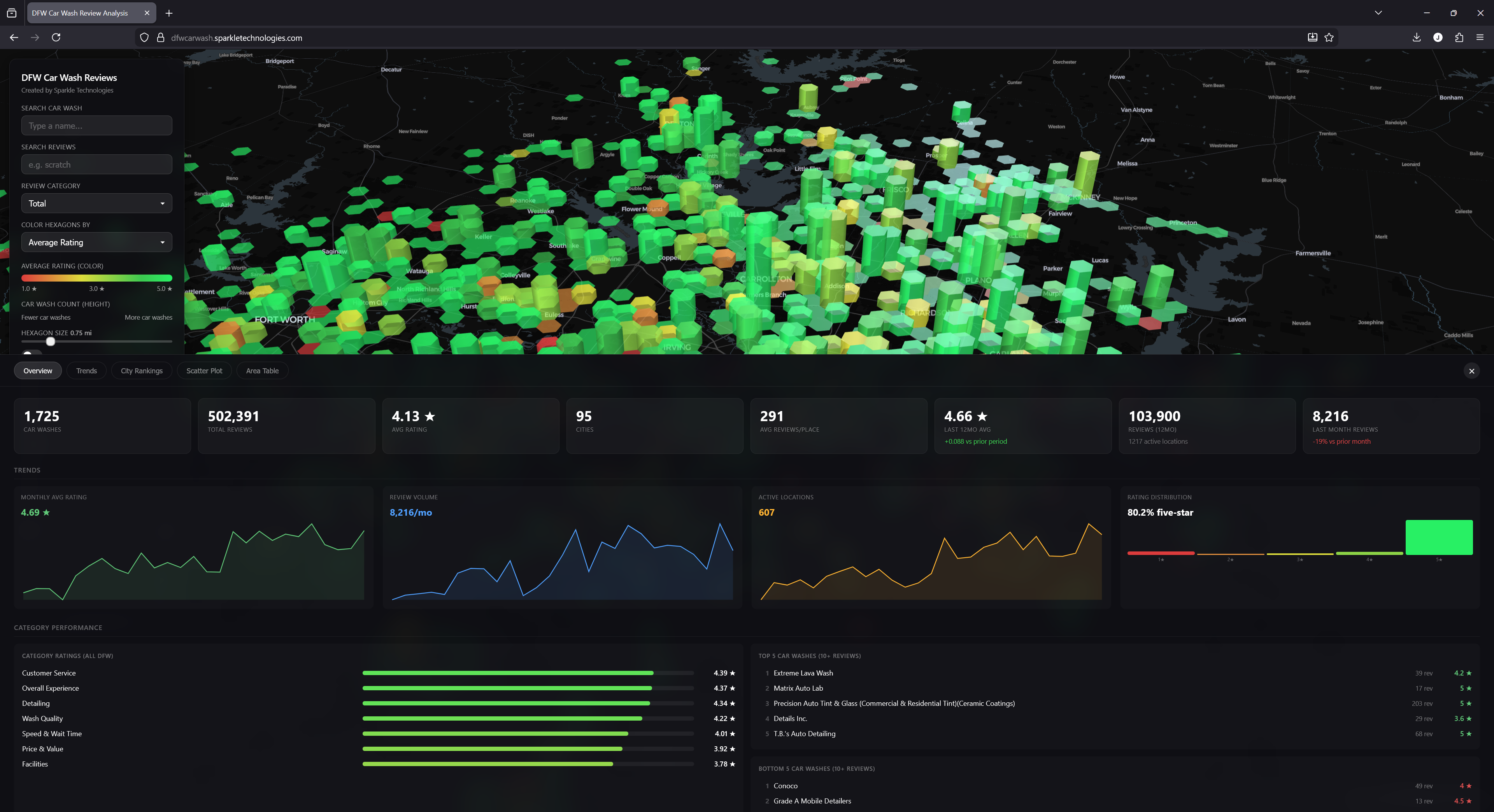
The full DFW landscape — 3D hexagons colored by average rating, sized by car wash density
The car wash industry is in the middle of a massive wave of private equity consolidation. New sites are being scouted, portfolios are being assembled, and operators are competing harder than ever. But most of the decision-making still runs on anecdote, drive-bys, and gut instinct.
We wanted to change that. At Sparkle Technologies, we do data science and engineering consulting — primarily for hedge funds and private equity firms. We built this platform to demonstrate what happens when you take a fragmented, local industry and apply the same analytical rigor that institutional investors expect in public markets.
The result is an interactive geospatial intelligence platform covering the entire DFW car wash market. Every car wash. Every review. Every neighborhood. All in one place.
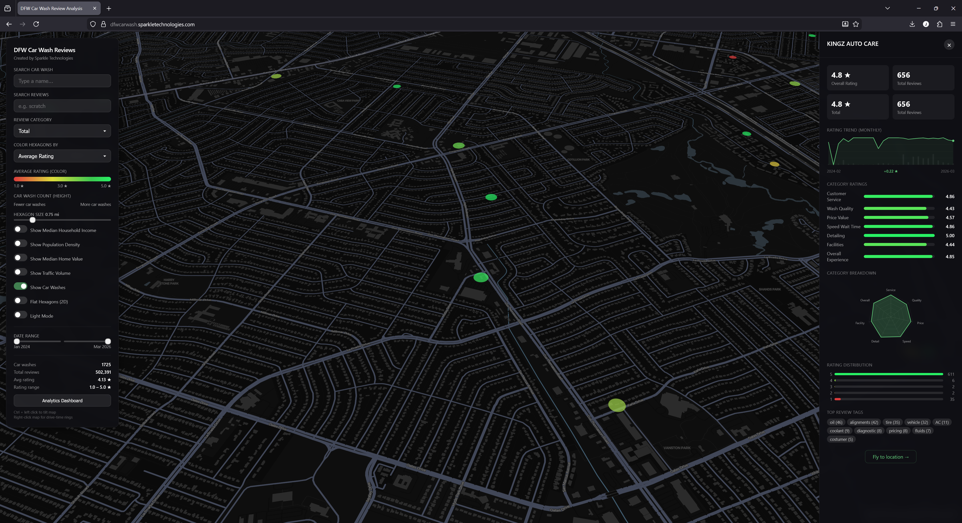
The Map: 1,725 Car Washes at a Glance
The core of the platform is a 3D hexagonal heatmap built on top of the DFW road network. Each hexagon represents a geographic cluster of car washes. The height encodes density — taller hexagons mean more car washes in that area. The color encodes performance — green means high average ratings, red means low.
At the metro-wide zoom level, you immediately see patterns that would take weeks to discover manually: where car washes are concentrated, where there are gaps, and where customer satisfaction is lagging.
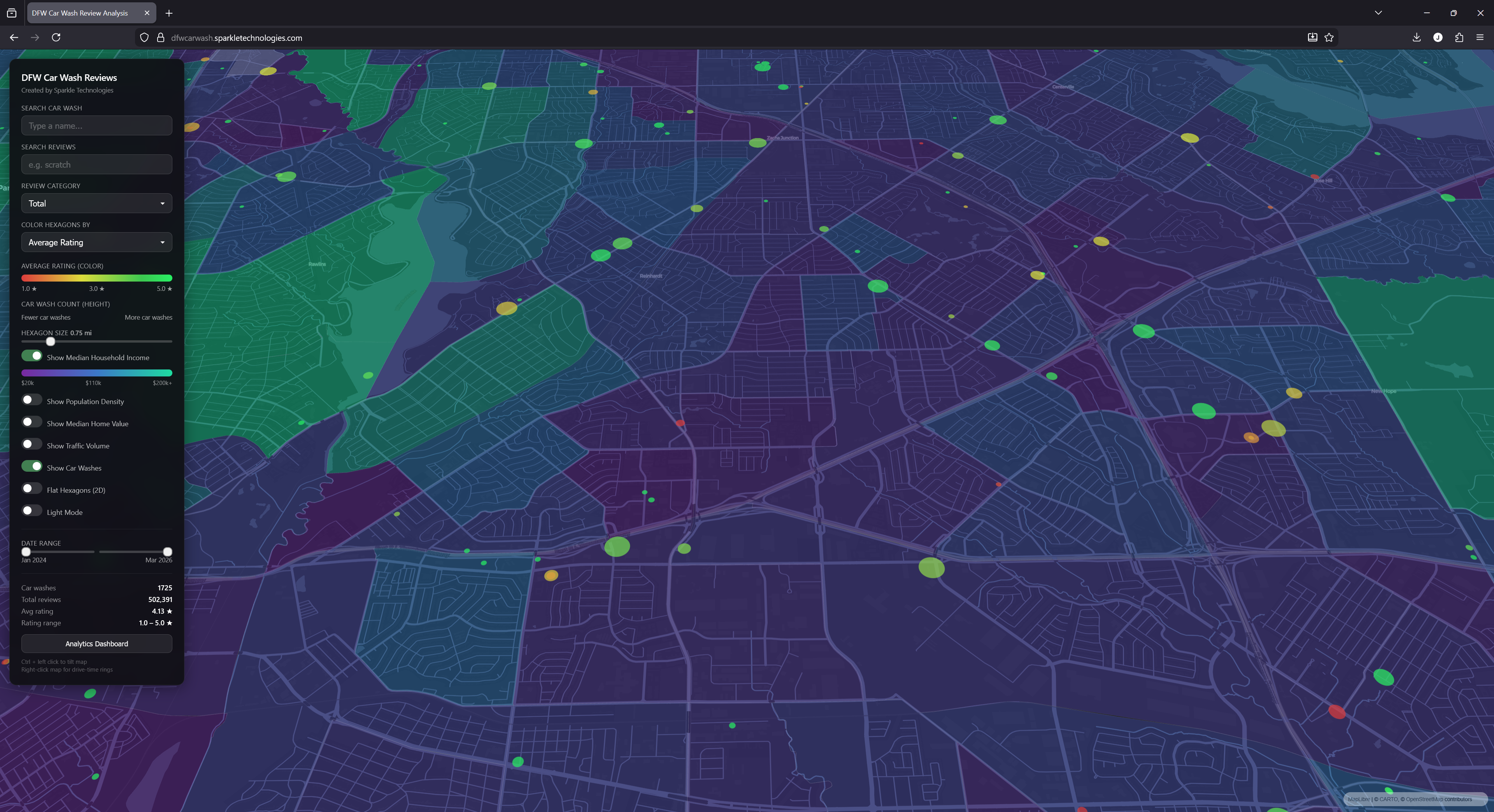
Zoom in and hexagons dissolve into individual locations — here shown with median household income overlay
Zoom in and the hexagons seamlessly transition into individual location markers. Each dot is a car wash, colored by its rating, sized by its review volume. You can toggle between 3D extruded hexagons and a flat 2D view, and switch between dark and light map styles depending on what you're presenting.
Click Anything. Get Everything.
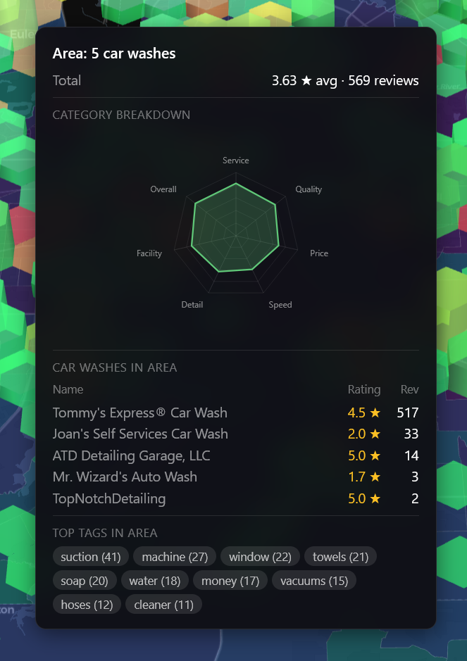
Every element on the map is interactive. Hover over a hexagon and you get a quick summary — the number of car washes in that area, their average rating, an opportunity score, a radar chart showing category strengths and weaknesses, and a list of every car wash with individual ratings and review counts.
Hover over any hexagon for a quick area summary
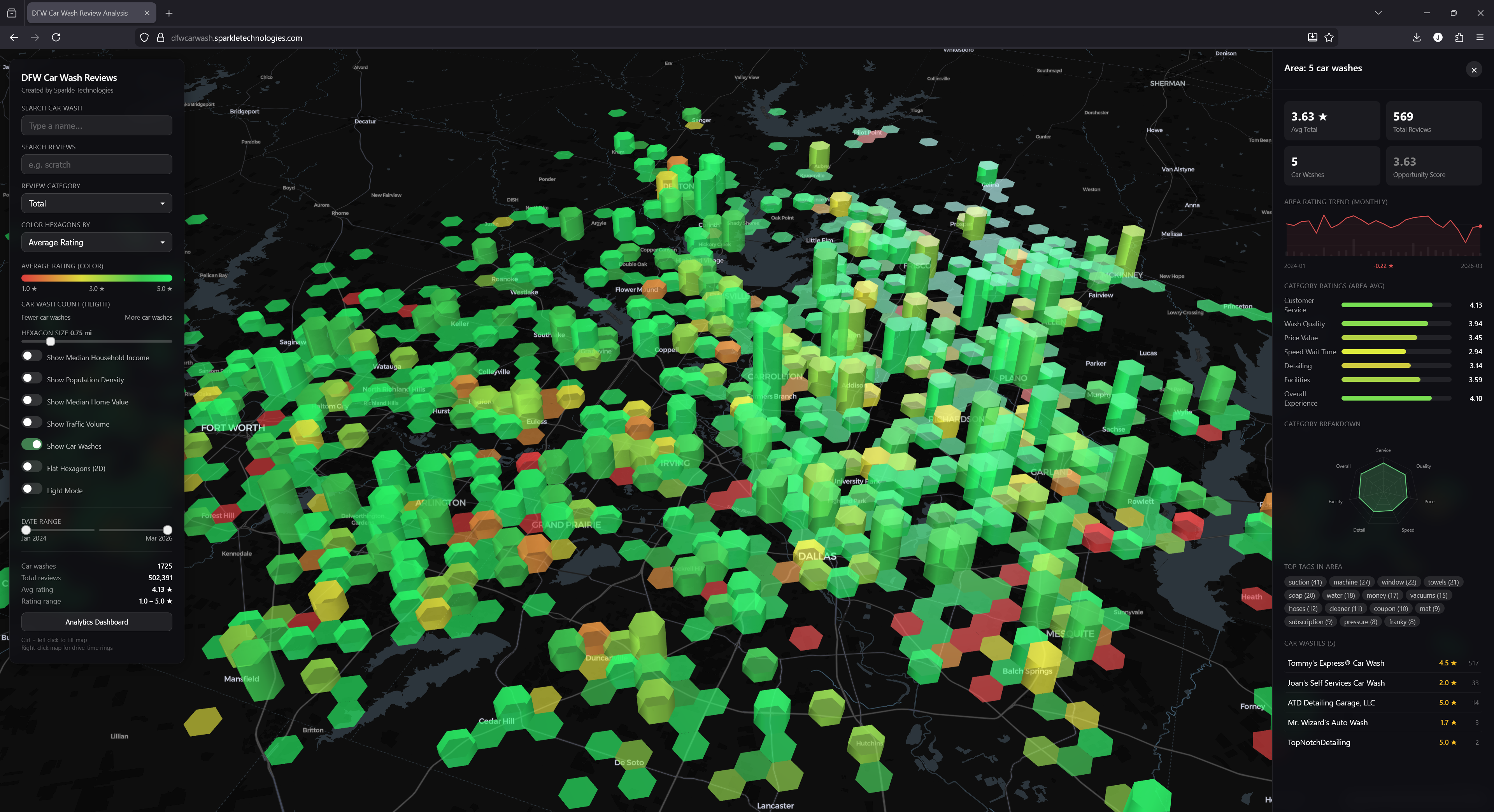
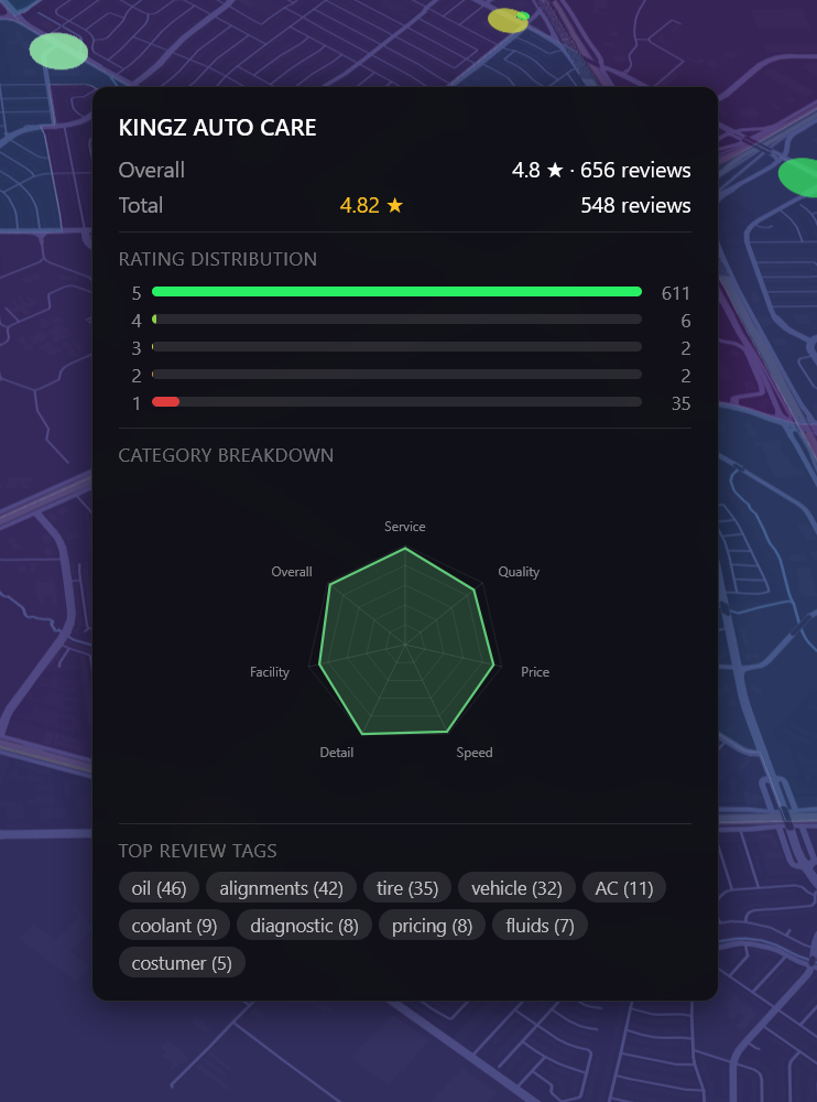
Click to open the full detail panel
Click the hexagon and you get the full deep-dive: a monthly rating trend sparkline, category-by-category ratings with bar charts, a star distribution breakdown, and the most common review tags extracted from the text — things like "suction," "machine," "towels," and "subscription." These tags surface the operational themes that matter most to customers in that area.
The same interaction model works at the individual car wash level. Hover for a quick glance, click for the full panel.
Hover over a car wash for ratings, distribution & tags
Full detail panel with trends and category scores
AI-Powered Review Categorization
A star rating tells you almost nothing about why customers feel the way they do. A 3.5-star car wash might have excellent wash quality but terrible wait times — or great facilities with rude staff. The aggregate number hides the story.
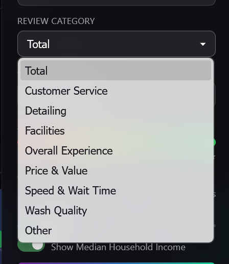
We used AI to classify every one of the 500,000+ reviews into specific performance categories: Wash Quality, Customer Service, Price & Value, Speed & Wait Time, Facilities, Detailing, and Overall Experience. You can filter the entire map by any single category, instantly reshaping the view to show which areas excel or struggle in that specific dimension.
Filter the entire map by any review category
This is powerful for competitive analysis. If you're an operator who prides yourself on detailing quality, you can filter the map to show only detailing ratings and see exactly where you rank relative to every competitor in your trade area.
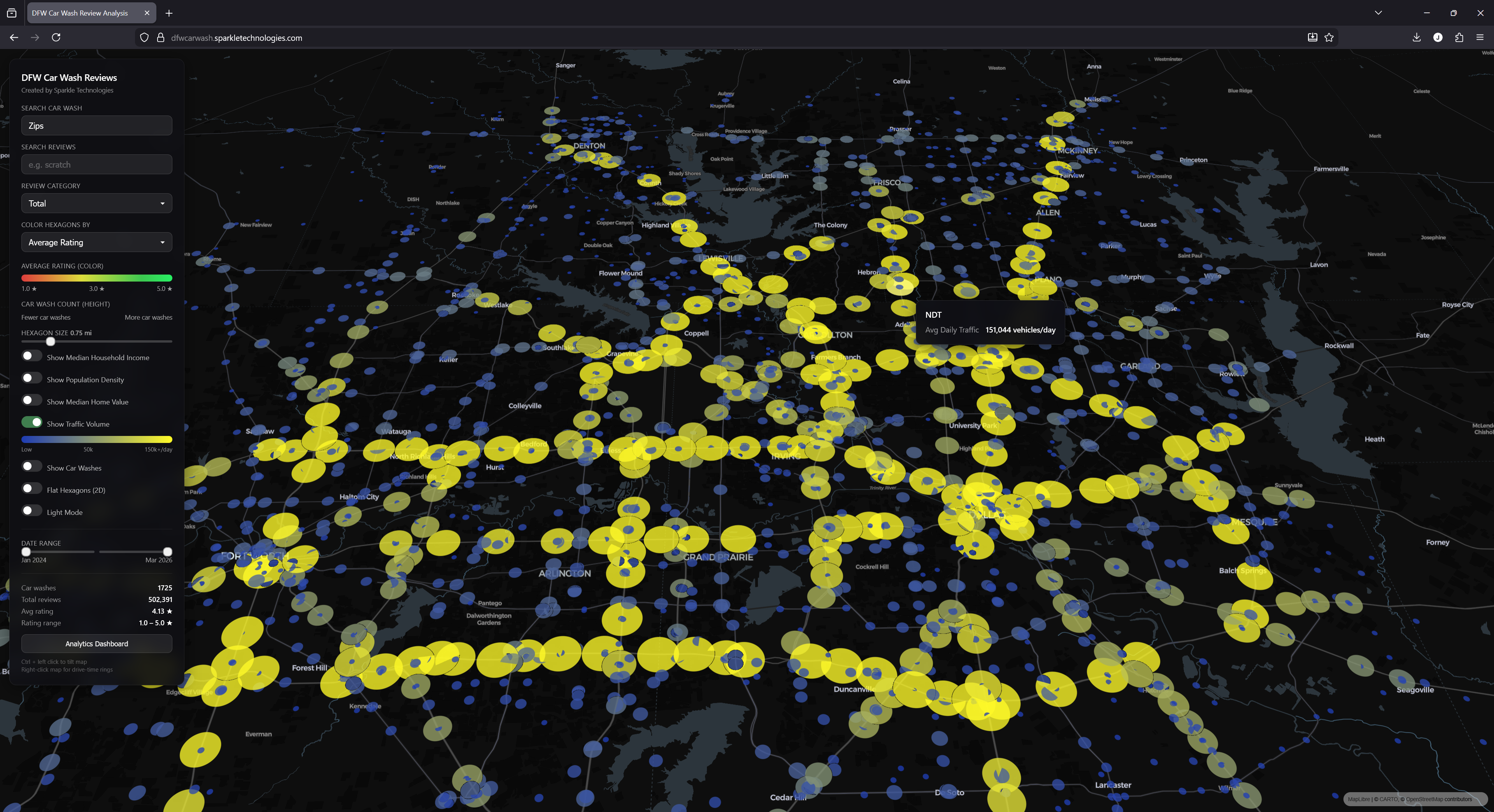
Demographic & Traffic Overlays
A car wash's success depends as much on where it sits as how it operates. We layered in three census-tract level demographic overlays — median household income, population density, and median home value — all rendered as color-coded choropleth maps that you can toggle on and off independently.
TxDOT average daily traffic volumes — circle size corresponds to vehicle count
We also integrated TxDOT traffic volume data, showing average annual daily traffic counts for road segments across the metroplex. Toggle it on and yellow circles appear along major corridors — the bigger the circle, the more cars per day. Hover over any one for the exact count.
Combine these layers and you can answer questions that used to require hiring a site selection consultant: "Where are the high-income, high-traffic areas with low car wash density?" Or: "Is this stretch of highway as busy as we think it is?"
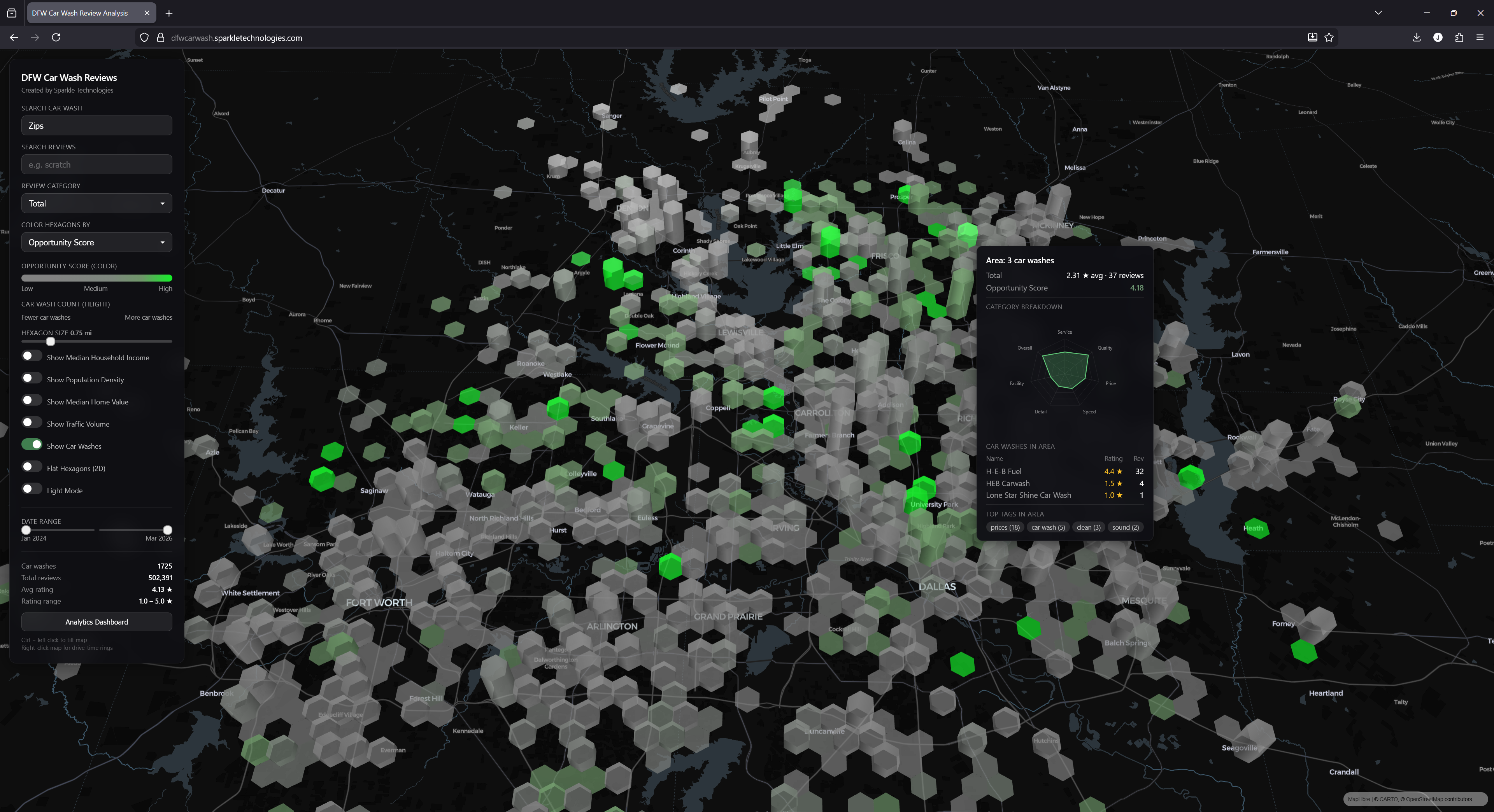
The Opportunity Score
This is where all the data converges into a single actionable metric. The Opportunity Score is a composite index that combines population density, household income, home values, local competition levels, and existing review ratings into one number for each area on the map.
Color the map by Opportunity Score to surface high-potential, underserved areas
Switch the hexagon coloring to Opportunity Score and the map lights up differently. The brightest green areas are the sweet spots — strong demographics, solid traffic, but either no car washes nearby or ones with poor ratings. These are the gaps in the market. The areas where a well-run new location is most likely to thrive.
The Opportunity Score doesn't tell you where to build. It tells you where to look — and it eliminates the 90% of the map where the fundamentals don't support a new location.
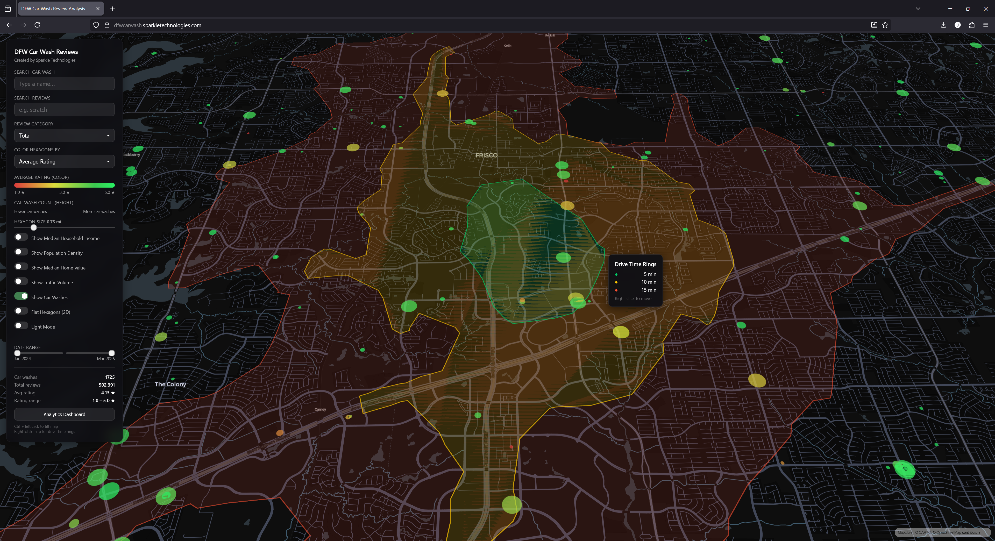
Drive-Time Analysis
Site selection ultimately comes down to drive time — not straight-line distance. Right-click anywhere on the map and the platform generates 5, 10, and 15-minute drive-time isochrones using real road-network routing. These are irregular, organic shapes that follow actual roads and account for highway access, intersections, and traffic patterns — not the simple radius circles you get from most mapping tools.
5 / 10 / 15-minute drive-time rings from a point in Frisco — based on real road-network routing
This lets you define the true trade area for any prospective or existing site. How many competitors fall within a 10-minute drive? What's the population base within 15 minutes? Overlay the demographic and traffic data and you have a complete site profile without ever leaving the platform.
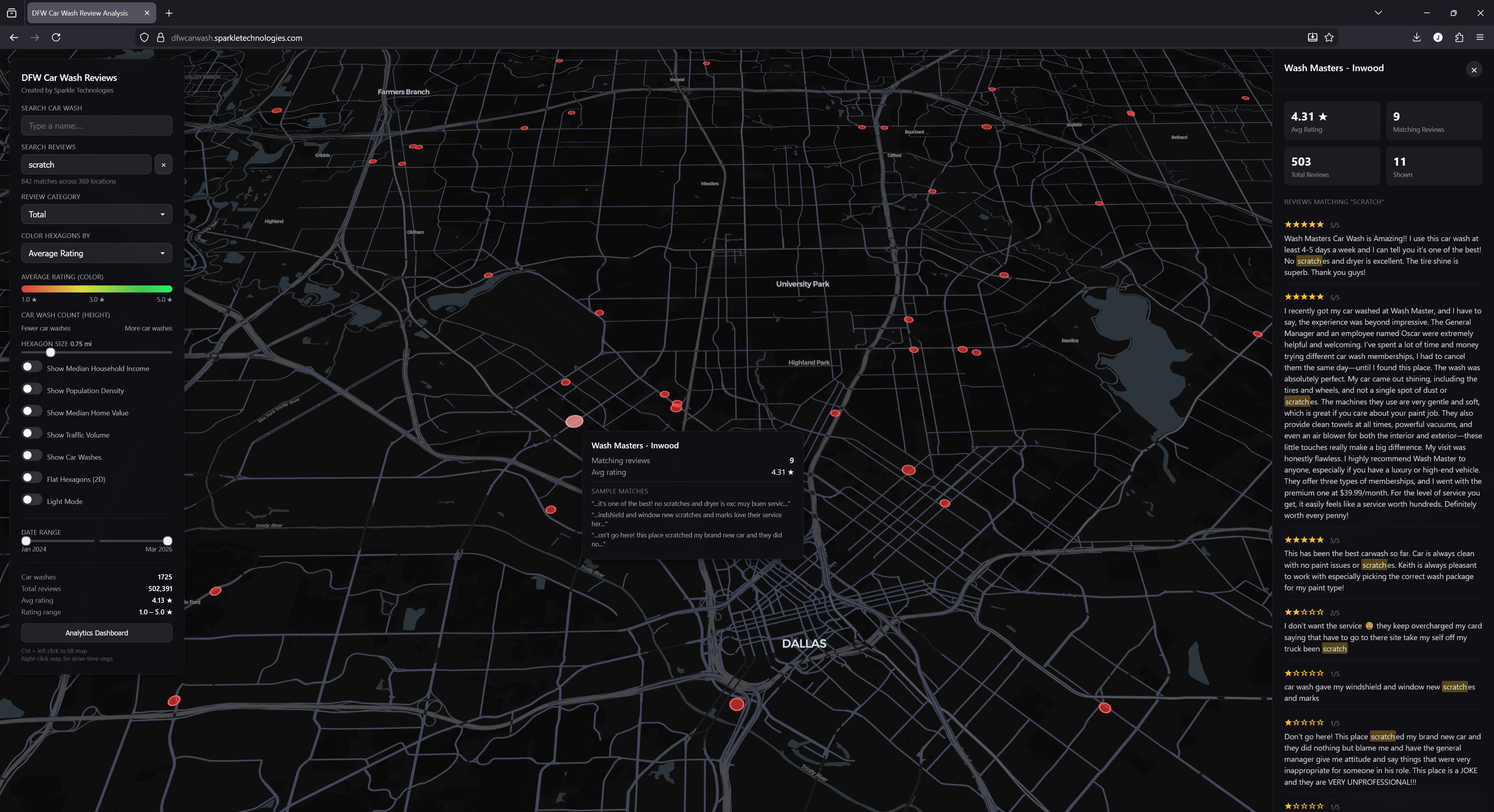
Full-Text Review Search
Sometimes you need to go granular. Our review search lets you query across all 500,000+ reviews for any keyword or phrase. Type "scratch" and the map updates to show only locations where customers mentioned scratches — sized and colored by the number of matching reviews. Type "membership" to see where subscription programs are being discussed. Type "wait" to find the pain points around speed.
Searching for "scratch" — 842 matches across 369 locations, with full reviews and keyword highlighting
Click any highlighted location and a panel opens with the matching reviews, each one showing the full text with your keyword highlighted in context. You can read what customers are actually saying, not just what their star rating implies.
For operators doing competitive intelligence or tracking specific operational issues across a market, this turns what would be weeks of manual review-reading into a 30-second search.
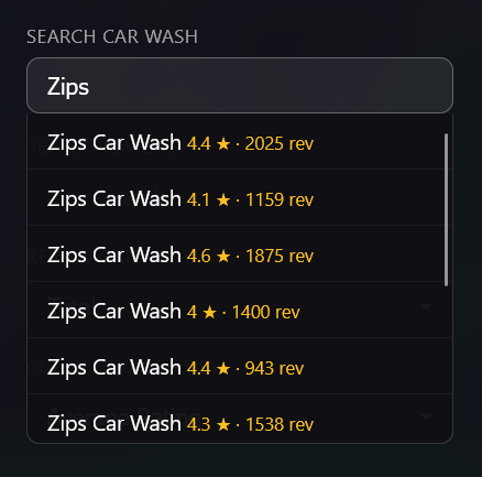
Search by Car Wash Name
Need to find a specific brand or location? The search bar supports instant lookup by car wash name. Start typing and matching locations appear with their rating and review count. Select one and the map flies to that location.
Instant search by name — every Zips Car Wash location with ratings and review counts
This is especially useful for chain operators who want to benchmark all their locations against each other, or for investors evaluating a specific brand's footprint across the metro.
The Analytics Dashboard
Behind the map sits a comprehensive analytics dashboard with five tabs, designed for the kind of analysis that goes beyond point-and-click map exploration.
The Overview tab — KPIs, trends, rating distribution, category performance, and top/bottom ranked car washes
Overview
Market-wide KPIs, trend sparklines, rating distribution, and top/bottom performers across the entire DFW metro.
Trends
Multi-city monthly rating trends with interactive line charts. Spot which markets are improving, declining, or seasonal.
City Rankings
Most improved, most declining, fastest growing, most active — all with 12-month comparison periods.
Scatter Plot
Correlate any two variables — income vs. rating, density vs. review count — with regression lines and r-values.
Area Table
Sortable city-by-city comparison with demographics, ratings, review velocity, and derived metrics. The spreadsheet view for exporting and comparing at scale.
Why We Built This
This is what we do at Sparkle Technologies. We build sophisticated analytical platforms for hedge funds, private equity firms, and operating companies — the kind of tools that turn fragmented data into clear, defensible decision-making. Market mapping, alternative data pipelines, geospatial intelligence, AI-powered analysis — we've done it across industries and asset classes.
And we do it fast. This entire platform — the data collection, the AI review categorization, the demographic and traffic integrations, the opportunity scoring model, the 3D interactive map, and the five-tab analytics dashboard — was built from scratch in roughly six hours. Not six weeks. Not six sprints. Six hours.
That's not a typo. It's the result of deep expertise in data science, data engineering, and visualization, combined with tooling and workflows we've refined across dozens of client engagements. When you've built these systems enough times, the architecture decisions are fast, the data wrangling is fast, and the polish comes naturally.
For our clients, that speed translates directly into edge. A PE firm evaluating a car wash portfolio doesn't have months to wait for market intelligence. An operator scouting new sites needs answers this week, not next quarter. We deliver production-grade analytical platforms on timelines that most teams would consider impossible.
If your firm needs this kind of intelligence — whether it's car washes, QSR, healthcare clinics, storage facilities, or any other fragmented market — we'd love to talk about what we can build for you.
Explore the Platform
The DFW Car Wash Intelligence Platform is live and interactive. See the data for yourself.